
Google Ads now generates AI-written explanations alongside your experiment results. The feature, which started appearing in accounts in early September, promises to translate raw A/B test data into narrative summaries that explain "the why behind the data." For marketing leaders who spend hours decoding experiment outputs for board decks and pipeline reviews, this sounds like a gift. It isn't, not yet. But it's worth understanding what Google built, where it helps, and where you still need your own model.
What Google Actually Shipped
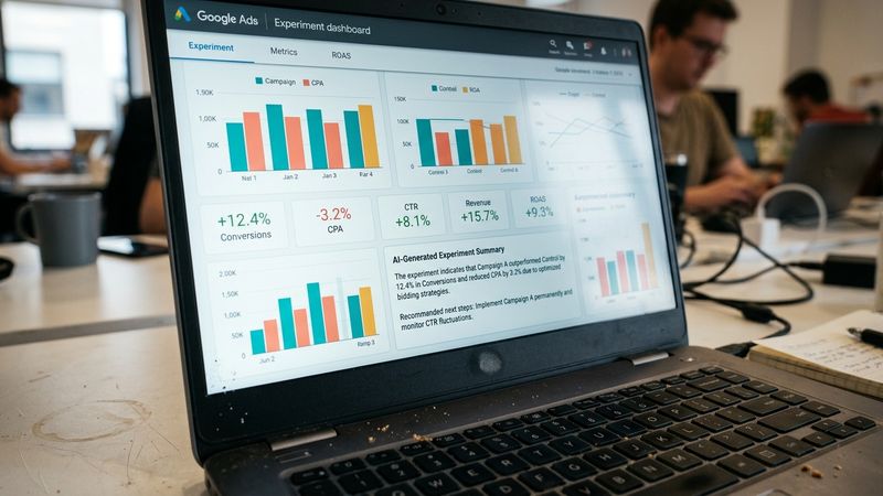
The update is part of a broader rollout announced in August that expanded Ask Advisor, Google's in-product AI agent, across both Google Ads and Google Analytics. The experiment-specific piece works like this: when you run an A/B test on budget, bidding, or targeting changes, the platform now auto-generates a real-time summary explaining what moved and why. You can also type plain-text prompts to generate custom charts and narrative reports from your experiment data.
The same update introduced AI Overviews on the Google Analytics homepage, surfacing performance shifts since your last login, and a benchmarking feature that compares your campaign metrics against anonymized averages from similar businesses. Search Engine Land reported that the tools are designed to "reduce the time spent interpreting data while keeping advertisers in control of campaign decisions."
Separately, Google expanded its experimentation toolkit to let advertisers test budget and ROI target changes across multiple Search campaigns in a single A/B test, rolling out in September. AI Max experiments can now run with brand and location controls enabled, which previously had to be disabled to test the feature.
The CFO Question: Does This Replace Your Analyst?
No. And here's why that matters for how you staff and budget.
The AI summaries are directional. They tell you what changed, not whether the change is statistically reliable, not whether the effect will persist at scale, and not whether the lift came from the treatment or from a confounding variable you didn't control for. Google's own documentation doesn't claim otherwise, but the interface makes it easy to mistake a narrative for a conclusion.
Consider a common scenario: you run a budget increase experiment across three Search campaigns. The AI summary reports a 12% lift in conversions. What it won't tell you is whether that lift came from incremental demand or from cannibalizing organic traffic. It won't flag that your control group had a seasonal dip that inflated the treatment's relative performance. It won't calculate whether the cost per incremental conversion justifies the spend at your current gross margin.
These are the questions your CFO will ask in the pipeline review. The AI summary gives you a starting point, not an answer.
Where the Feature Actually Helps
The value is in speed-to-hypothesis, not speed-to-decision. Three use cases where the AI summaries earn their place:
First, triage. If you're running a dozen experiments across campaigns, the summaries let you quickly identify which tests warrant deeper analysis. A summary that says "conversion volume increased but CPA rose faster than revenue" tells you where to focus your analyst's time.
Second, stakeholder translation. The narrative format is easier to drop into a Slack thread or a weekly standup than a raw data table. For cross-functional alignment with Sales or Product, a plain-English summary reduces the friction of getting everyone on the same page about what the experiment tested and what it showed.
Third, prompt-based exploration. The ability to ask natural-language questions about your experiment data is genuinely useful for hypothesis generation. "What happened to impression share during the test period?" or "How did mobile performance differ from desktop?" can surface patterns you wouldn't have thought to query manually.
The Benchmarking Feature Deserves Scrutiny
The new benchmarking tool in Google Analytics compares your campaign performance against anonymized averages from "similar businesses." BestMediaInfo reported that this gives marketers "an additional reference point when assessing whether campaigns were performing above or below comparable businesses."
The problem is that "similar" is doing a lot of work in that sentence. Google hasn't published the methodology for how it defines similarity, what variables it controls for, or how much variance exists within each benchmark cohort. A B2B SaaS company with a 90-day sales cycle and a B2B SaaS company with a 14-day trial-to-paid motion might both land in the same "similar businesses" bucket, but their benchmark CPAs should look nothing alike.
Use the benchmarks as a sanity check, not a target. If your CPA is 3x the benchmark, that's a signal to investigate. If it's 10% above, that tells you almost nothing without knowing the composition of the comparison set.
What This Means for Your Experiment Design
The AI summaries don't change the fundamentals of good experiment design. They just make it easier to skip the fundamentals and regret it later.
Before you run any test that will generate one of these summaries, document three things:
- Your minimum detectable effect (what lift would actually matter to the business)
- Your holdout structure (how you're isolating the treatment effect)
- Your success criteria (what metric, measured over what window, constitutes a win)
The AI summary will tell you what happened. Your pre-registered design tells you whether what happened is meaningful.
For multi-campaign experiments, the new capability to test budget and ROI changes across a portfolio is useful, but it also increases the risk of confounding. If you're testing a 20% budget increase across five campaigns, and three of them share audience overlap, you're not running one experiment. You're running a mess. The AI summary won't flag that for you.
The Governance Layer You Still Need
One comment on the LinkedIn announcement thread put it well:
"AI can surface the signal faster. The marketer still has to separate signal from noise."
For teams operating under any kind of measurement governance, whether that's a formal MMM framework, an incrementality testing protocol, or just a CFO who asks hard questions, the AI summaries are an input, not an output. They belong in the "what we observed" section of your analysis, not the "what we recommend" section.
The risk is that the narrative format makes the summaries feel more authoritative than they are. A chart with confidence intervals forces you to confront uncertainty. A paragraph that says "performance improved due to increased budget allocation" sounds like a conclusion.
Build the habit now: every AI-generated summary gets a one-line annotation from your team noting what the summary doesn't account for. Seasonality? Audience overlap? Lag effects? That annotation is what turns a Google feature into a board-ready insight.
The Pilot Worth Running
If you haven't enabled the AI dashboards yet, start with a single campaign where you already have a strong baseline and a clean experiment history. Run a test you've run before, one where you know what the result should look like. Compare the AI summary to your own analysis. Note where they align, where they diverge, and what the summary omits.
That calibration exercise takes two weeks and costs nothing. It tells you exactly how much weight to put on the AI's interpretation for your specific account, your specific business, and your specific tolerance for measurement risk.
The feature is useful. The feature is not a substitute for judgment. Model accordingly.


