
Most B2B advertising dashboards answer the wrong question. They tell you how many impressions you served, not whether those impressions moved accounts toward revenue. The gap between "campaign ran" and "campaign worked" is where marketing credibility dies in board meetings.
Demandbase's Advanced Reporting for Advertising, launched in , takes a different approach. The feature embeds a Looker instance directly into the platform with four pre-built dashboards: Pacing, Country-Level, Creative Performance, and JourneyIQ. The promise is board-ready data without the CSV export ritual that consumes hours of analyst time every week.
The Reporting Gap That Created This Feature
B2B attribution remains broken for a structural reason: the average buyer journey now involves 27 or more touchpoints across 6 to 18 months, yet most reporting tools still credit the last click before conversion. When 70 to 80 percent of conversions in GA4 show up as "Direct/none," three out of four deals have no usable channel insight. The webinar that warmed up the account? Invisible. The display campaign that introduced the brand? Zero credit.
This creates a specific problem for advertising teams. You can prove you spent the budget. You cannot prove the spend influenced pipeline. Finance sees cost; they do not see contribution.
Demandbase's response is to connect top-of-funnel ad metrics directly to account progression. The March 2026 product update describes the goal plainly: "board-ready data to prove ROI, completely eliminating the need for manual CSV exports."
What Each Dashboard Actually Does
Country-Level Reporting shows where spend generates engagement. You can view impressions and performance by country, drill down to state-level data within the United States, and identify geographic regions where campaigns perform best. The practical use case: if the United States generates the highest impressions while another country underperforms, you can adjust targeting before the budget bleeds out.
Creative Performance operates at two levels. Ad Group analysis compares performance across different ad groups. Creative-level analysis shows performance for individual assets within each group. The workflow is straightforward: identify highest-performing creatives, prioritize successful ads, pause or replace underperformers. This is not revolutionary, but having it inside the same platform that tracks account progression removes a data reconciliation step.
Pacing & Account Performance addresses the question that keeps campaign managers awake: are we on track to spend the budget at the right rate, against the right accounts? Under-pacing campaigns can be adjusted in real-time rather than discovered in a post-mortem.
JourneyIQ is where the reporting connects to revenue. According to Demandbase's JourneyIQ playbook, the framework allows a single advertising campaign to target accounts across the entire funnel, from Awareness through Acquisition, Acceleration, and Customer stages. Budget "follows" accounts as they progress. Creative rotates based on journey stage. The reporting layer then shows how impressions and spend tie to pipeline performance.
The Cross-Platform Consolidation Play
Demandbase's 3rd Party Campaigns page aggregates spend, impression, and click metrics from Demandbase, LinkedIn, and Google Ads into a single view. Historical data syncs within 24 to 48 hours for LinkedIn and up to 8 days for Google. Ongoing updates arrive within 24 hours.
This matters because cross-platform measurement remains a mess. Industry data shows platform dashboards across Google and Meta often over-report conversions by 120 to 160 percent of actual verified totals. When each platform claims credit for the same conversion, the numbers do not add up, and finance loses trust in the entire marketing measurement apparatus.
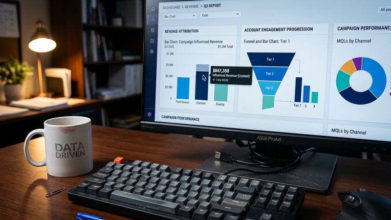
Centralizing the data does not solve attribution. It does eliminate the manual consolidation step that introduces errors and delays. The Campaign Outcomes Trend Graph lets you compare performance metrics across all platforms, view by daily, weekly, or monthly intervals, and export selected metrics as CSV when you need to share outside the platform.
Ad Metric Selectors: Turning Reporting Into Action
The Ad Metric Selectors feature connects advertising data to the rest of the Demandbase platform. You can create lists, filters, and reports based on advertising impressions, clicks, and targeting status.
The use cases are specific:
- Target accounts with impressions or clicks below a threshold to increase exposure
- Limit overspending by removing accounts that have hit a specified threshold
- Auto-export audiences based on ad metrics to LinkedIn, Meta, and Google through Orchestration
- Create retargeting campaigns for accounts that previously engaged with specific messages
The practical value: you can compare accounts that were targeted by a campaign against accounts that were not, then measure differences in journey stage progression, engagement, and velocity. This is the differential evidence that CFOs can independently verify in CRM data.
What This Means for Board Conversations
Demandbase's 2026 State of ABM report, based on data from 1,452 tenants and 429,634 ad campaigns, found that organizations aligning marketing and sales around buying groups achieve 2 to 3 times higher win rates than teams centered on individual leads. Win rates peak when teams focus on 2 to 3 buying groups per product. Engagement depth correlates with conversion: buying groups receiving 180 to 190 touches reach a 94 percent conversion rate.
The reporting infrastructure exists to surface these patterns. Whether your team uses it depends on whether you have the discipline to define journey stages, map them to advertising funnel designations, and review the data consistently.
The embedded Looker instance removes the technical barrier. It does not remove the organizational one. You still need agreement on what "influenced" means, which stages matter, and how to handle the accounts that touch multiple campaigns before converting.
The Two-Week Pilot
If you are evaluating Advanced Reporting, start with a narrow scope. Pick one campaign with clear journey stage mapping. Run it for two weeks. Compare the JourneyIQ data against your existing attribution model. Document where the numbers diverge and why.
The risk is minimal: you are using reporting features already included in the platform. The learning is whether the embedded dashboards actually reduce the time between "data available" and "decision made." If your team still exports to spreadsheets for analysis, the feature has not changed behavior. If the board conversation shifts from "how much did we spend" to "which accounts progressed," you have something worth scaling.


